Cases, Digital Design
Figma Design System Creation and Implementation


Design System Creation and Implementation
- Client: NDA
- DESIGN SYSTEM CREATION FOR A GLOBAL OIL, GAS and POWER BUsiness
Case Study
Figma Design System Development of a comprehensive design system in Figma to ensure consistency, scalability, and efficiency across all digital products.
Duration: 4 months
Objectives
- Consistency: Ensure uniformity in design across all platforms and products.
- Scalability: Create a system that can grow with the company’s expanding product lines.
- Efficiency: Reduce design and development time by providing a library of reusable components.
Challenges
- Existing Disparate Styles: The client had multiple products with inconsistent design elements. The design system creation solved this problem
- Team Coordination: The design and development teams were using different tools and methods.
- Component Overload: The need to manage a large number of components without overwhelming the design system.
Approach
-
Research & Analysis:
- Conducted stakeholder interviews to understand pain points and requirements.
- Analyzed existing products to identify common patterns and discrepancies.
-
Foundation Setup:
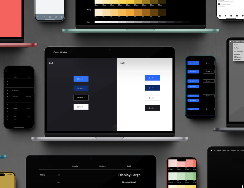
- Defined core principles and guidelines (typography, color palettes, spacing, etc.).
- Established a visual language that aligns with the client’s brand identity.
-
Component Library Creation:
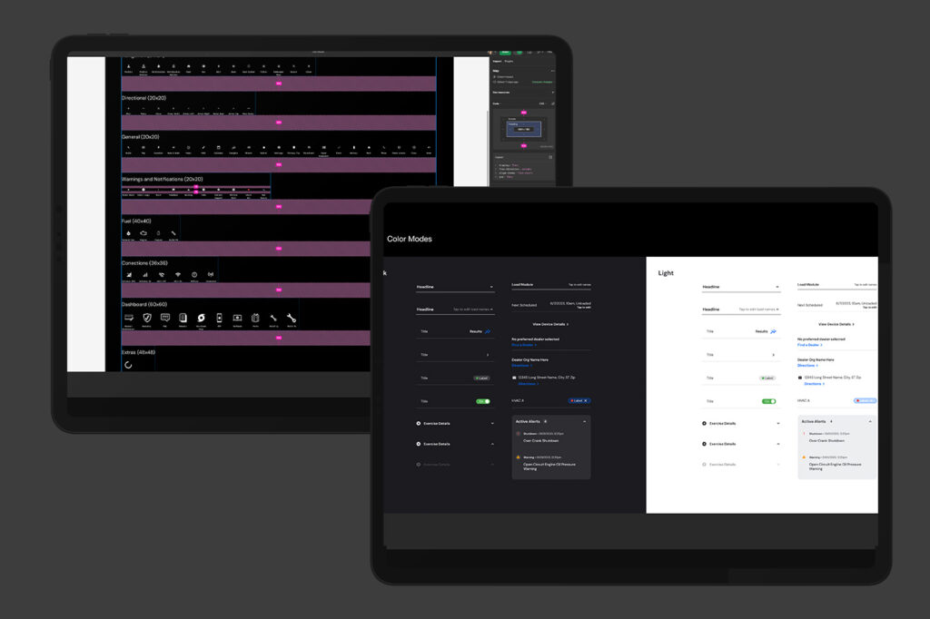
- Created a comprehensive set of reusable components (buttons, forms, modals, etc.).
- Organized components into intuitive categories for easy access and scalability.
- Applied design tokens and color variables to escalate the design system to different brand themes across the organization
-
Prototyping & Testing:
- Developed prototypes to test the design system’s effectiveness.
- Gathered feedback from designers and developers for iterative improvements.
-
Documentation:
- Provided thorough documentation for each component, including usage guidelines, code snippets, and best practices.
- Created tutorials and onboarding materials to facilitate adoption.
-
Implementation & Training:
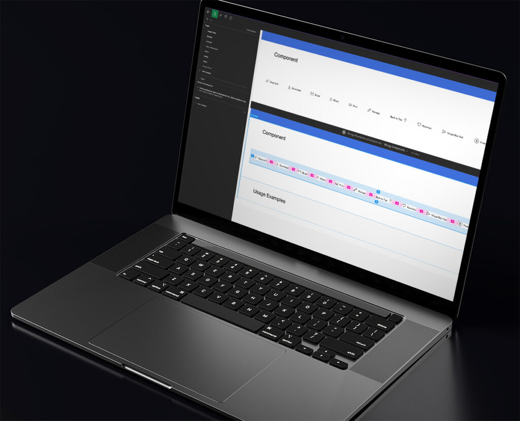
- Integrated the design system into Figma, ensuring seamless collaboration.
- Conducted training sessions for the design and development teams.
Tools & Technologies
- Figma: Primary tool for creating and managing the design system.
- Zeroheight: Used for documenting the design system.
- Slack & Jira: Facilitated team communication and project management.
Outcome
- Increased Consistency: The design system ensured uniformity across all products, reinforcing the brand identity.
- Improved Efficiency: Design and development time was significantly reduced due to reusable components.
- Enhanced Collaboration: Unified tools and processes improved coordination between designers and developers.
- Scalability: The system was designed to easily incorporate new components and adapt to future needs.
Metrics of Success
- Design Consistency: 30% reduction in design inconsistencies reported.
- Time Savings: 40% reduction in design and development time for new features.
- Adoption Rate: 95% adoption rate among the design, content and development teams within the third month.
- Implementation: the client was able to launch 5 websites within a period of 6 months
Future Steps
- Continuous Improvement: Regularly update the design system based on user feedback and evolving brand needs.
- Community Engagement: Foster a community within the organization to share insights and improvements.
- Expand Usage: Explore extending the design system to external partners and clients.